The Brief
Groth Beserk had already developed a concept for the cover and came to the project with a clear idea of what he wanted. The first question he asked was whether Emma used AI. The answer was no, which was the deciding factor in moving forward.
The Comet Core is a LitRPG progression fantasy. Five coworkers get pulled out of a Monday marketing meeting by something that is definitely not Halley's Comet, and dropped onto an alien megastructure to compete in escalating dungeon trials against teams from other planets. The cover needed to hold both halves of that premise: the cold scale of deep space above, and the very human, slightly absurd office drama trapped inside the rock below. Groth's initial concept already understood this tension. The job was to build it by hand rather than generate it, and refine it based on feedback to make sure every character detail matched what he had written.
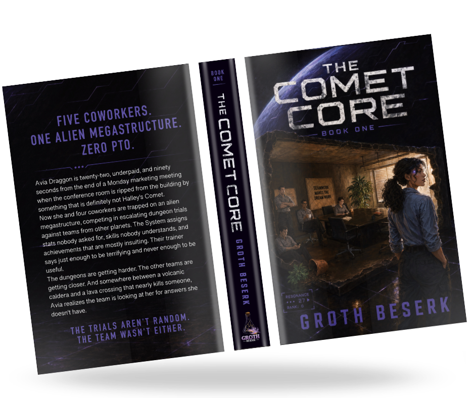
Visit Groth Beserk ↗A weathered, stencil-cut wordmark sits against open sky, built to survive thumbnail size on a retail page while still carrying weight on the physical spine.
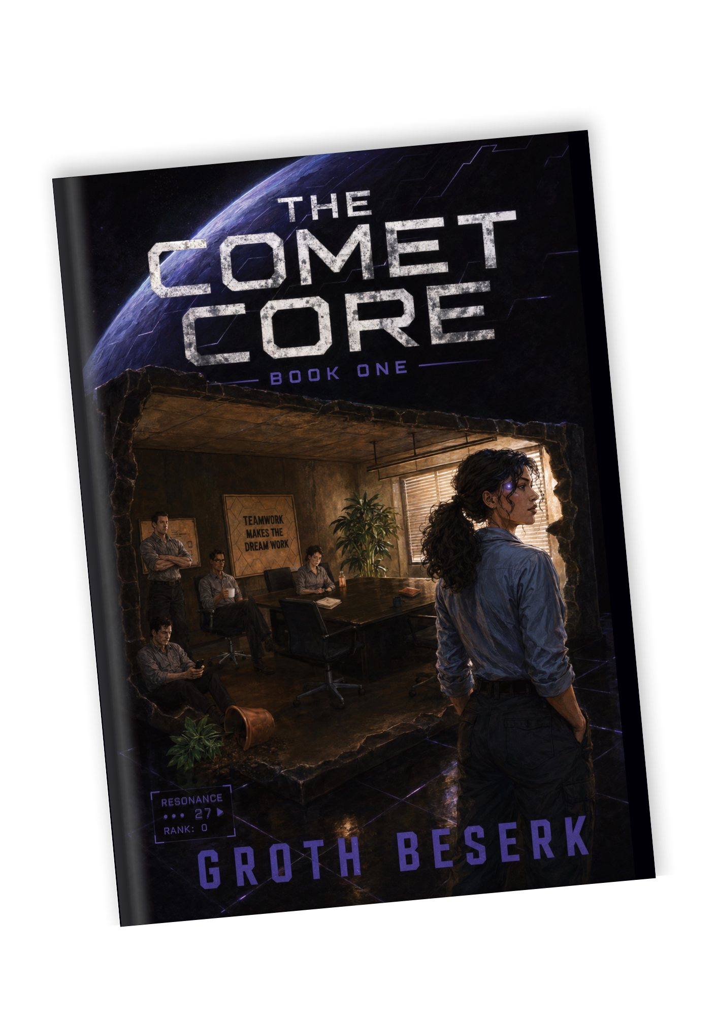
Void black and deep nebula navy ground the composition, with a single resonance-violet accent reserved for the title, status readout, and author name.
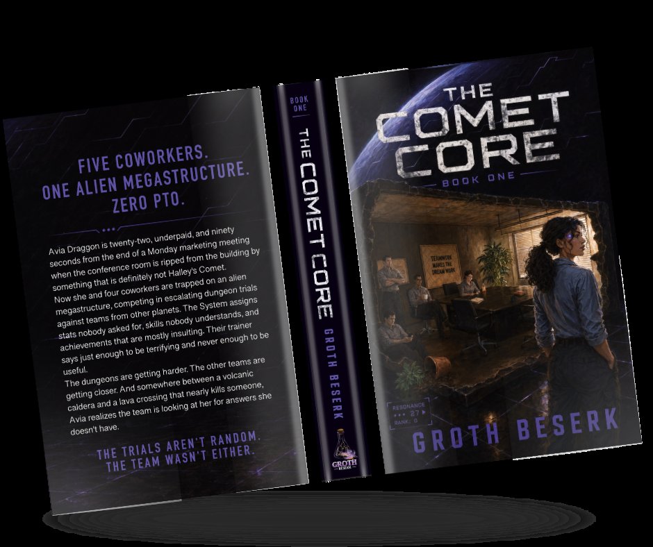
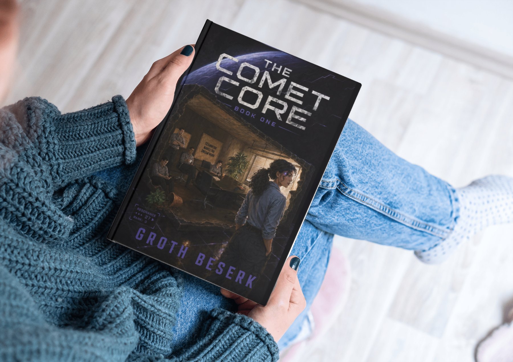
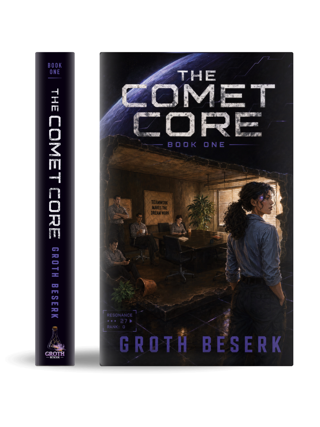
3D hardback and full-jacket mockups were built and lit to match the painted cover art exactly, so the book reads true across listings, ads, and socials.
How the cover was built
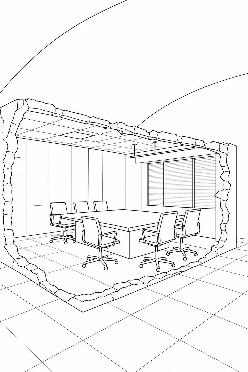
Drawing the conference room from scratch, in vectors
The whole interior scene is hand-drawn in Affinity Designer using vector paths, not painted, not AI generated. Every chair, window blind, ceiling tile, and the spilled plant pot in the corner was placed deliberately. The ragged rock edge framing the room is what sells the premise: this is a normal office that has been physically ripped out of a building and deposited somewhere it absolutely should not be.
Getting the perspective right across the floor grid and ceiling tiles took the most time here. If those lines weren't reading as a convincing interior, nothing else would work. Seeing it on a white background at this stage makes the construction logic visible in a way it isn't once colour and atmosphere are added.
Vector illustration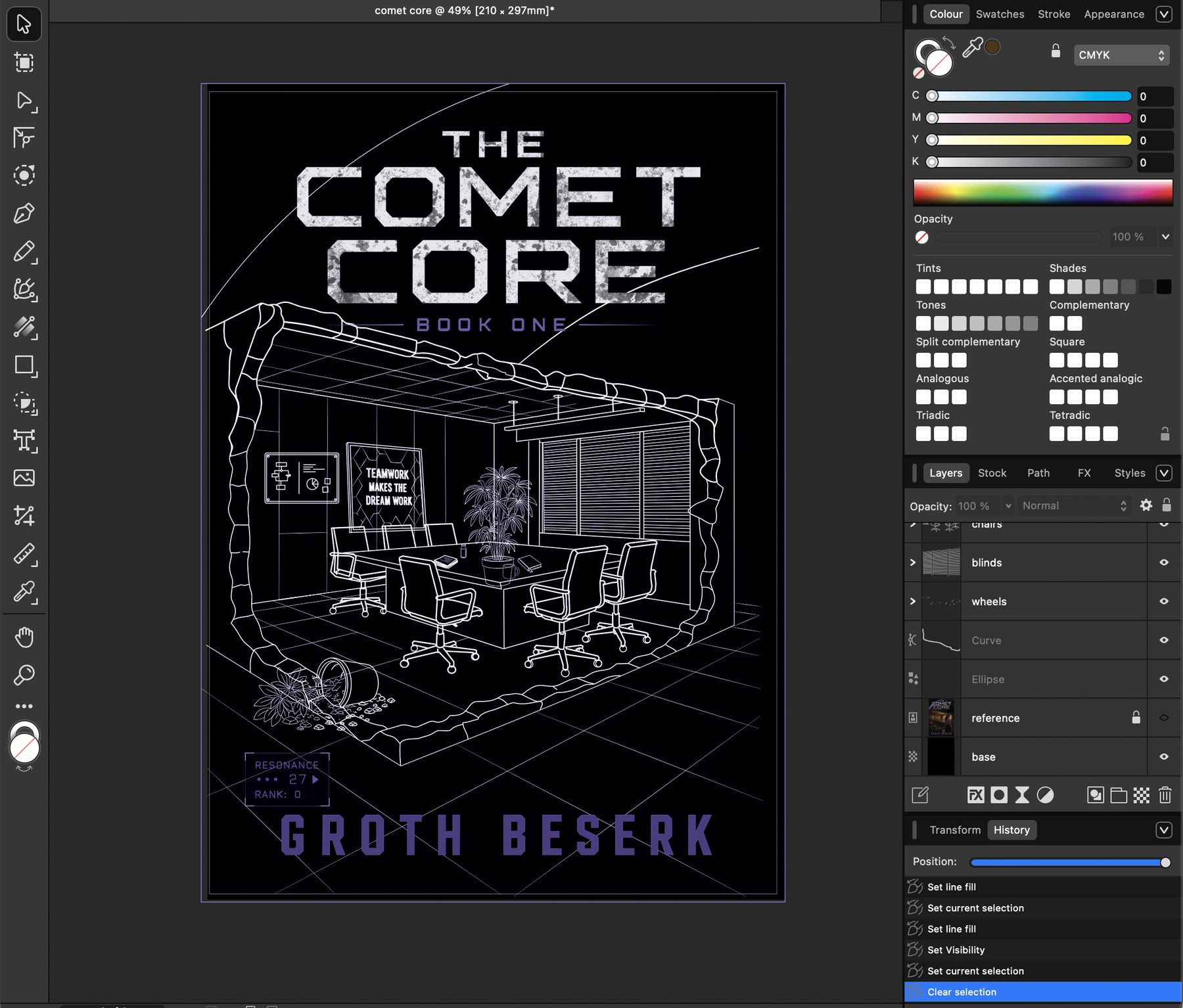
Getting the scene and the title to agree on the same page
The first thing to figure out was scale. The title had to be massive, because on a retail thumbnail at 200px wide, if readers can't read the name instantly they scroll past. But if it takes up too much vertical space, the illustration underneath gets squashed into nothing and loses all its storytelling.
Starting in Affinity Designer, the title was placed first and the scene was built around it, not the other way around. The grid lines running across the cover floor came in at this stage too, anchoring the office in a way that already starts to feel like something is off about the space it's sitting in.
Affinity Designer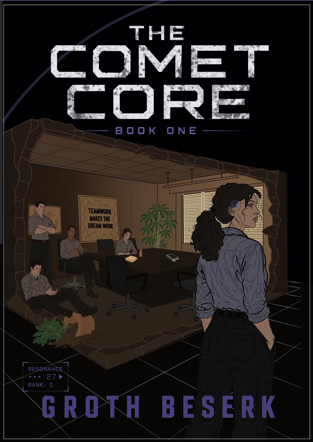
Blocking in the palette and getting the five team members right
Colour came in as flat fills first. The inside of the office runs warm, browns and muted orange-greens, so it reads as a mundane, familiar space. The outside stays cold and dark. That contrast is doing the narrative work without any caption needed.
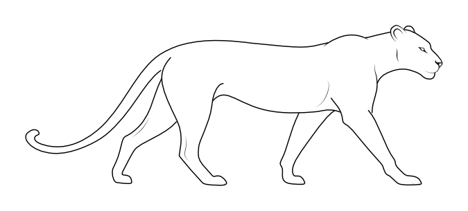
The five characters were placed at this stage. Avia, the protagonist, stands to the right with her back mostly to the viewer, with a neural interface disc on her temple that Groth specified should sit about an inch to the left of her eye, roughly a centimetre across, with a glint catching the light. Phil has glasses. The character who sits on the floor rather than a chair does so because that is simply his thing, a character trait that Groth wanted preserved. The seated character at the table appears to be holding something, and that something is a white mug, again a specific character detail. These are the kinds of things that make the difference between a cover that represents the book and one that just looks like the book.
The plant pot in the corner caused a small problem: one character's legs appeared to be resting on it. The layers were rearranged so the pot sits in front, and the character's seated position was adjusted slightly so the space reads correctly.
Character placement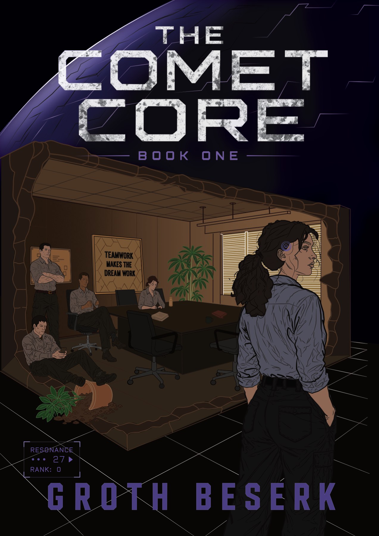
Choosing painted over photorealistic, and finishing every detail
At this stage there was a conversation about visual style. Groth gave artistic licence on the approach, so Emma proposed going painterly and illustrated rather than trying to match the photorealistic quality of the AI concept image he had originally used as a reference. A painted style suits sci-fi well because it gives the cover a deliberate, intentional quality rather than looking like it is trying to be a photograph and not quite getting there. Groth agreed.
The planet behind the title was the last major element added. It needed to read as enormous, which meant positioning it so only the lower arc is visible and letting the title sit in front of it. At thumbnail size this creates an immediate sense of something gigantic in the background without cluttering the composition.
From here the final render involved shading, lighting adjustments on Avia so she separates cleanly from the dark edge of the frame, strengthening the highlights across the planet, the plant and Avia's face, and adding more definition and contrast throughout so it would hold up on print as well as screen. The resonance readout in the bottom left, a small in-world stat display showing "Resonance 27, Rank 0", was the finishing detail, a piece of visual language that rewards anyone who has read the book.
Final render