
The Brief
A confident wordmark with a single underscoring swash, designed to feel equally at home on a paper carrier bag, a rigid gift box, or stitched into canvas. Santi's identity trades ornament for a single, well-placed gesture.
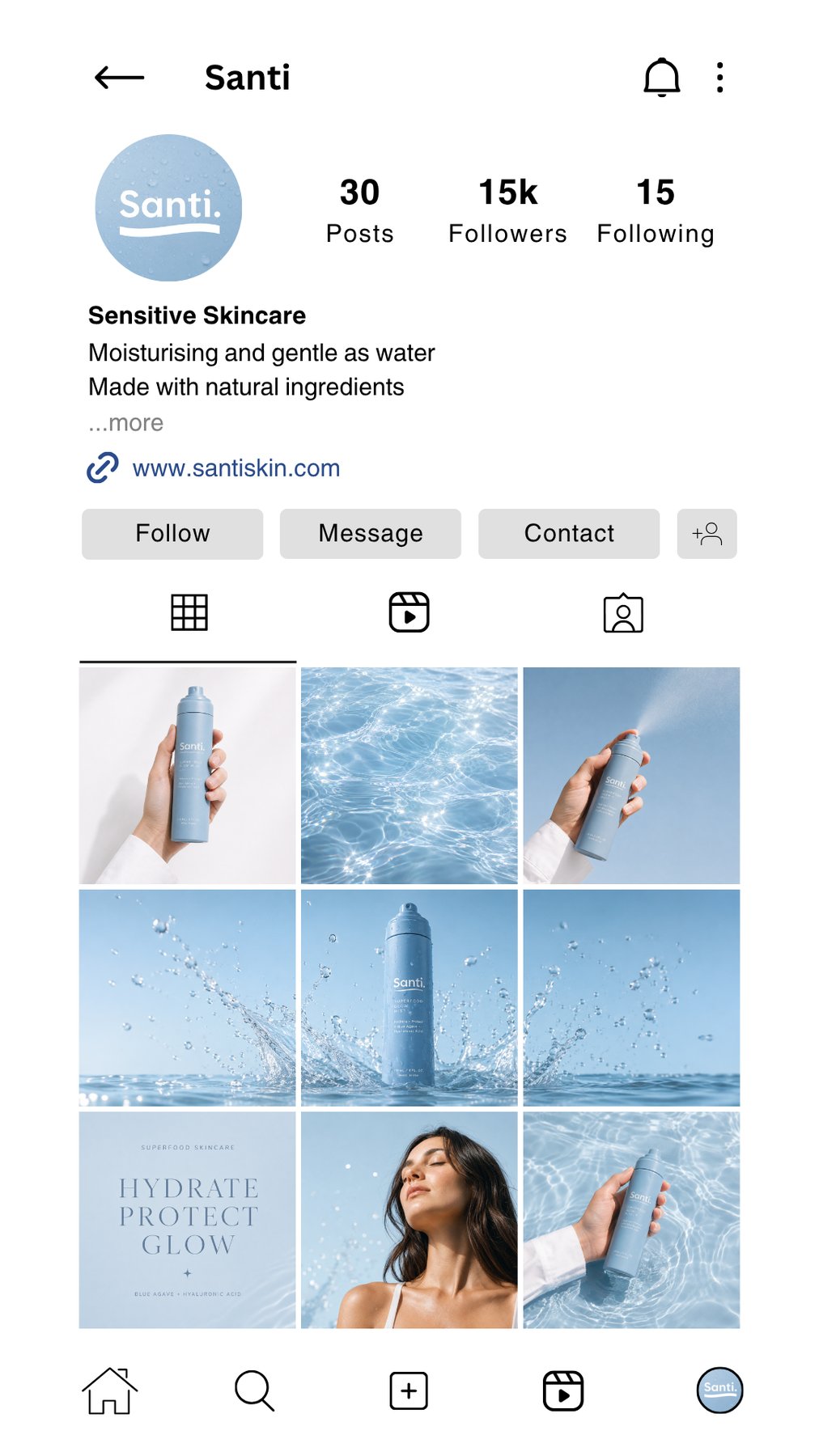
That same restraint carries through to social: a feed built on soft blues, water textures and white space, so the brand reads as cool, clean and gentle as the mist itself, before a single ingredient is mentioned.


Social Media Direction
Creating a feed that feels as gentle as water.
The Santi feed needed to sell the feeling before the formula: cool skin, clean hydration and a light daily ritual. A repeating system of soft blues, water textures and white negative space carries the wordmark's single swash through every post, so the page reads as one brand at a glance.
Soft hydration
Water textures and light reflections create freshness without making the brand feel clinical.
Product clarity
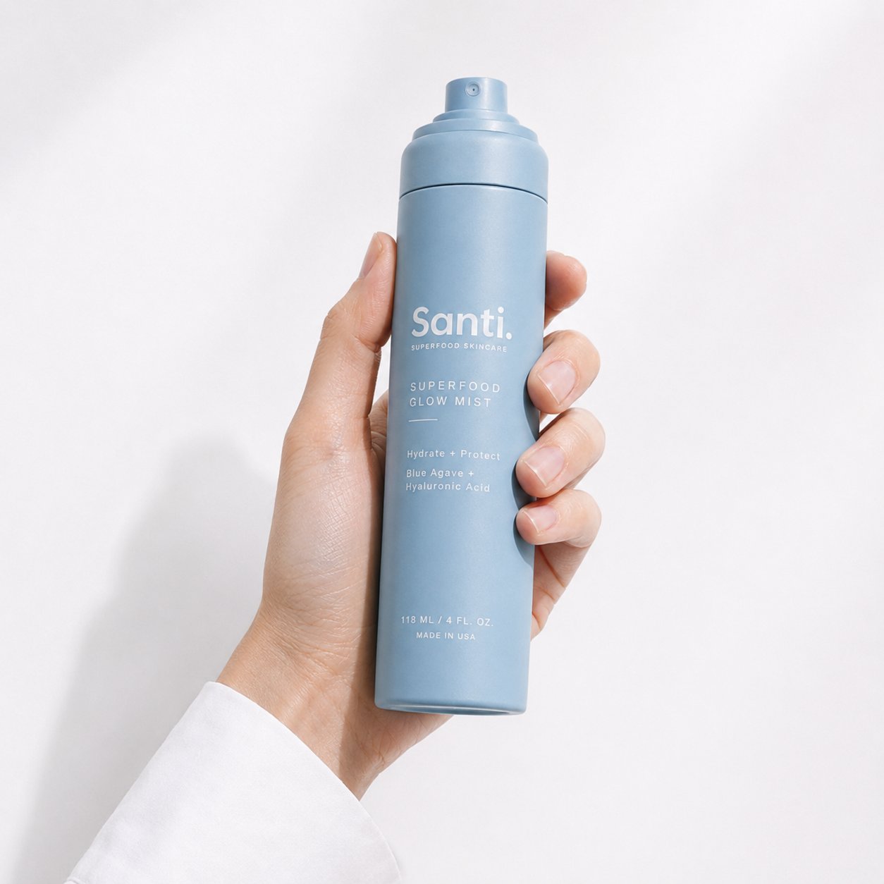
Clean crops keep the packaging readable and make the mist instantly recognisable.
Premium calm
Large negative space and restrained typography stop the feed feeling crowded.
Human ritual
Skin and hand shots add warmth, scale and a lifestyle feeling.
Instagram Presence