Leche
Matcha & Herbal Teas — Wordmark
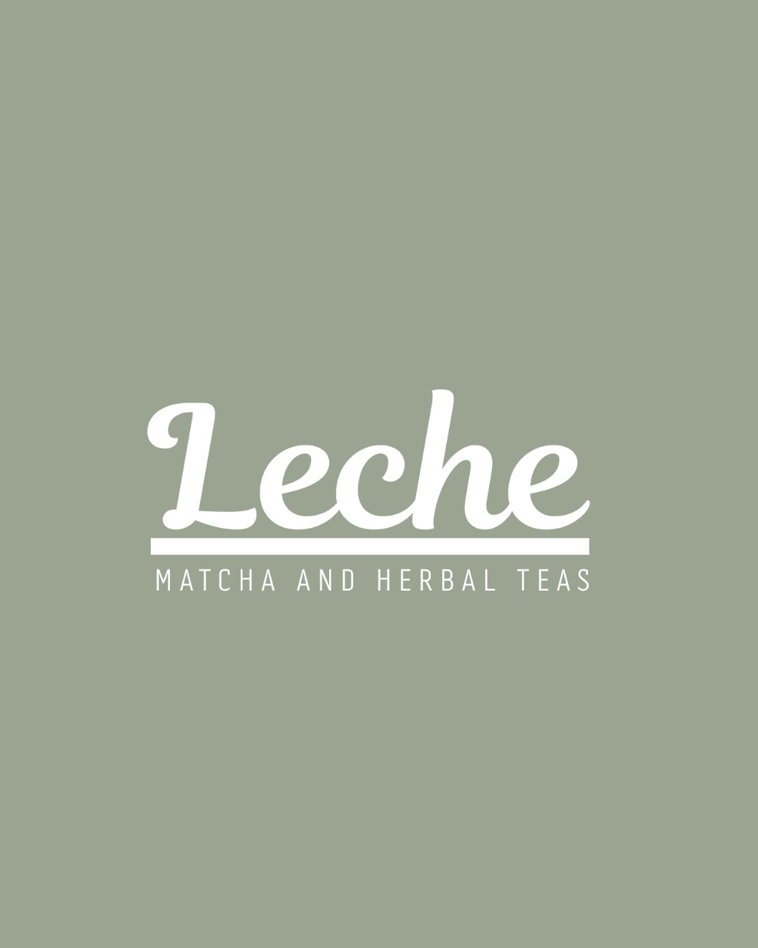
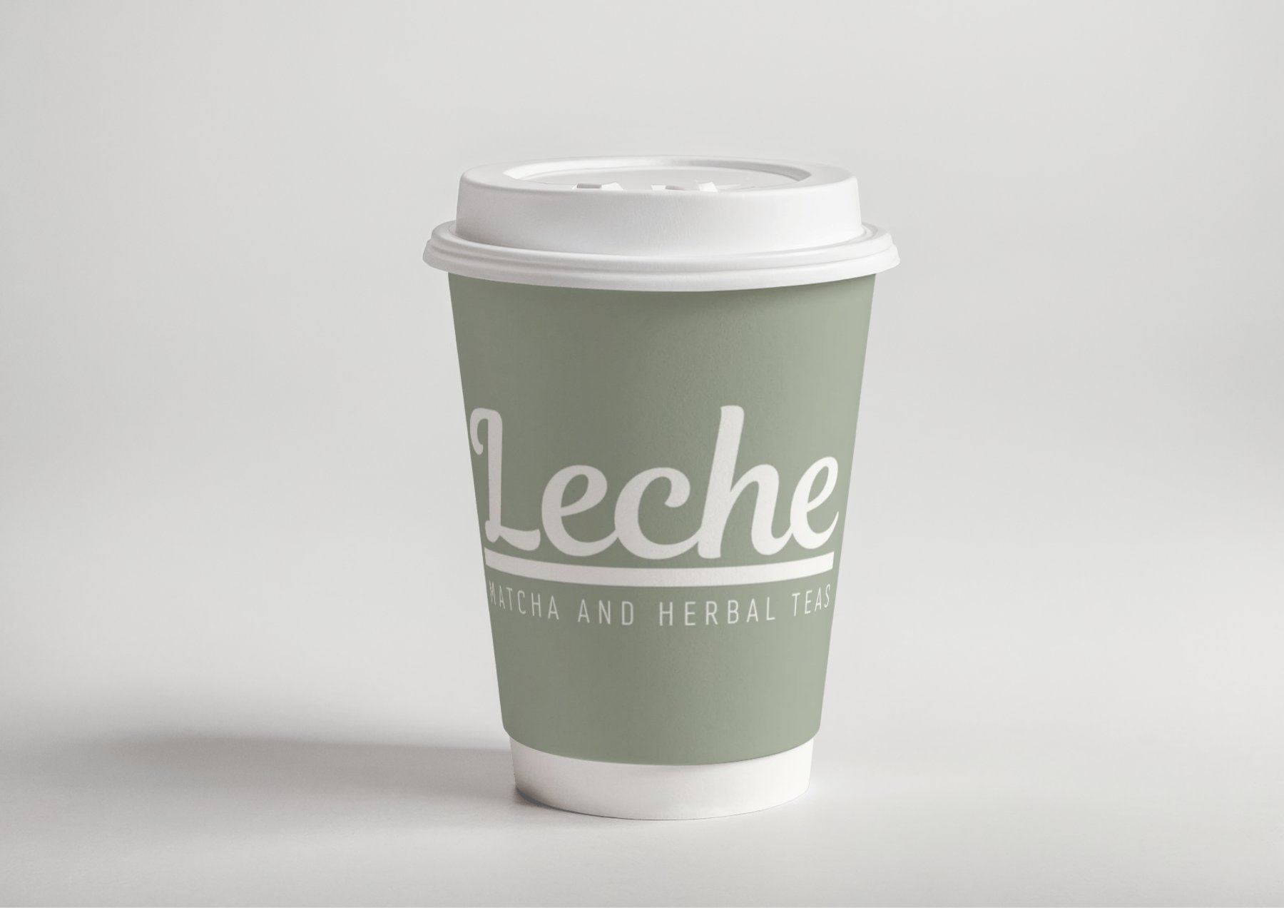
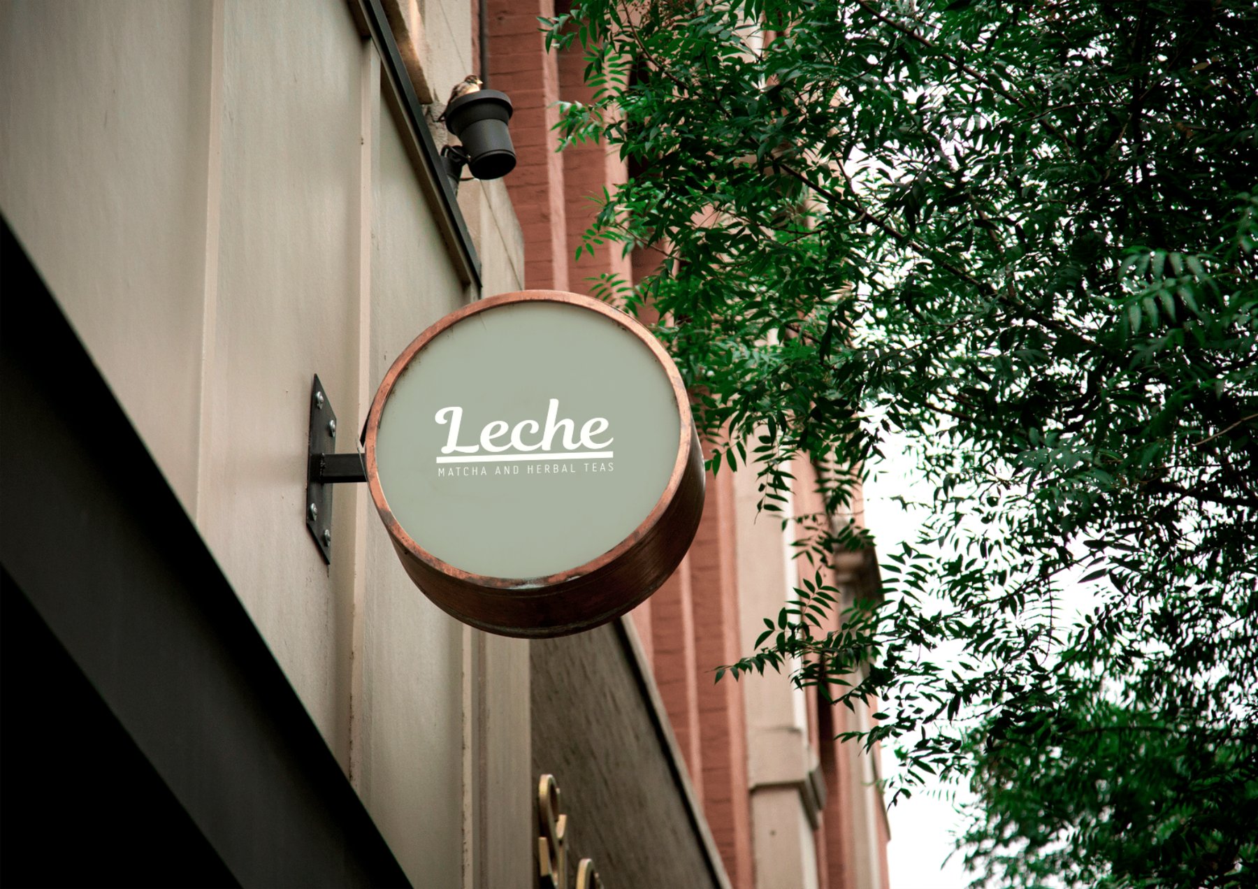
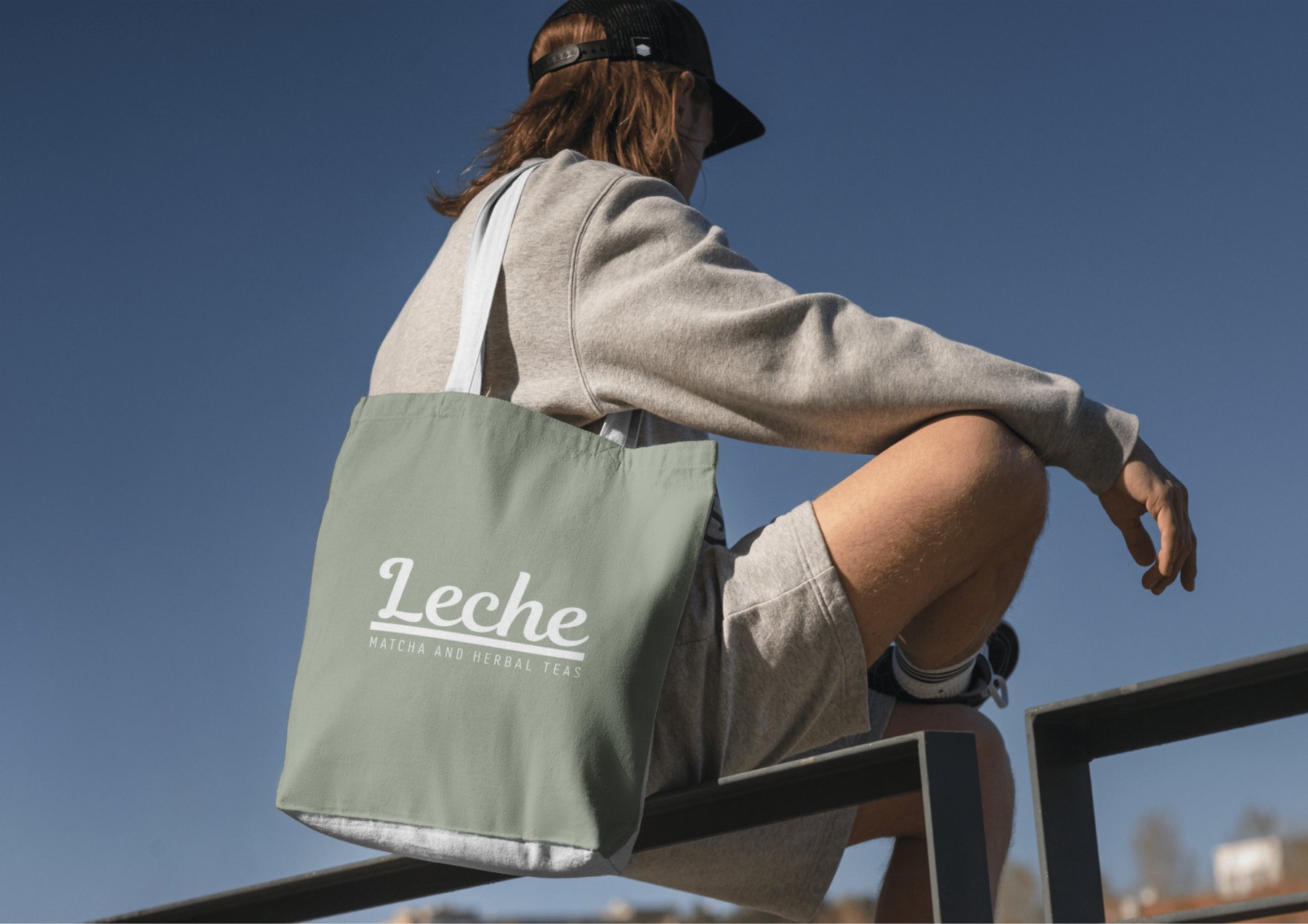
Leche is a matcha and herbal tea brand. The logo is a script wordmark above a rule, with the tagline beneath it in spaced caps. Three elements, one unified mark.
What looks simple on screen is the result of a lot of careful decision-making about type, spacing, weight and colour. Each choice was made for a reason, and most of those reasons operate on a level that people feel rather than consciously notice.
Script typefaces trigger a subconscious association with handwriting, which the brain reads as personal and made with care. For a tea brand where the whole proposition is ritual and craftsmanship, that association is valuable. It makes the brand feel warm without having to say it.
The tagline is set in spaced caps, which creates deliberate contrast with the fluid script above. This is a classic pairing technique: when two type styles share a composition they create visual tension, and that tension is what generates hierarchy. Your eye goes to the script first, then reads the caps below. The brand name lands before the descriptor, which is exactly right.
The horizontal rule between the wordmark and tagline does two things. It separates two elements that would otherwise compete visually, and it creates a grounding line that the whole mark sits on. Logos with a strong horizontal base feel more stable and trustworthy to the eye, because we unconsciously associate horizontal lines with stillness and solidity.
The alignment work
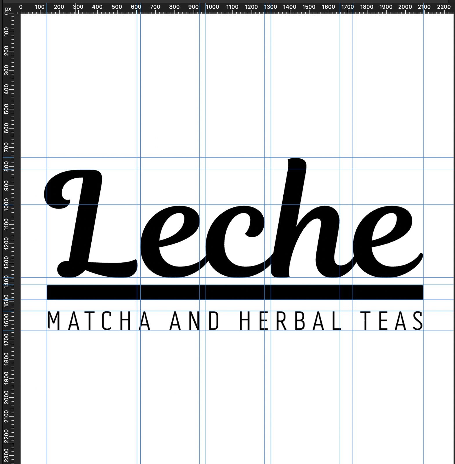
Why the rule width is set to the optical edge of the script, not the mathematical one
The guidelines here are placed at the optical left and right edges of the script wordmark, and the rule is sized to match them exactly. This is an important distinction: the mathematical width of the word would include the whitespace inside curves and around ascenders, which looks wrong. The optical width is where the letterforms actually end visually, which is what matters.
If the rule were wider than the script it would create a gap that makes the mark look unanchored. If it were narrower, the name would appear to hang loose above it. Getting this relationship exactly right is the difference between a mark that looks considered and one that looks accidental. Most people would not be able to say why it feels off, they would just feel it.
The spacing between the script, the rule and the tagline was also checked here. Equal spacing between elements does not always produce equal-looking spacing, because different letterforms and weights create different visual density. The gaps were adjusted by eye until the three elements read as one cohesive block rather than three things near each other.
Affinity Designer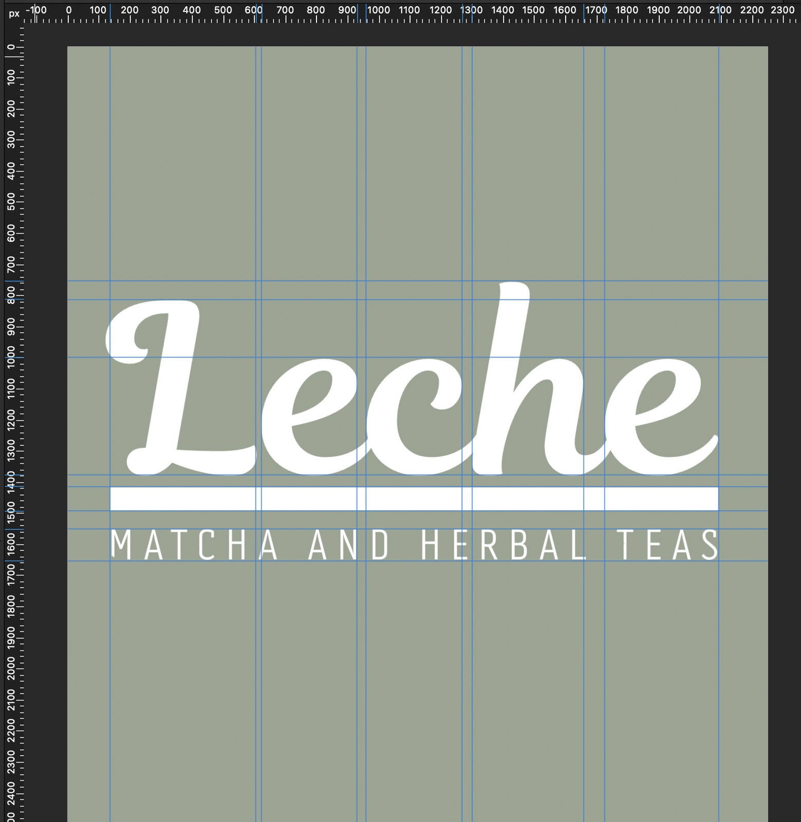
Why sage green was the right background colour and why white was the right text colour for it
Sage green sits in the muted, desaturated end of the green spectrum. Greens in general carry associations with nature, plants and health, which are all directly relevant to a tea brand. But it is the desaturation that matters most here: a bright green would read as fresh and commercial, like a supermarket own-brand. Sage reads as premium, calm and intentional.
White text on sage green creates a softer contrast than black on white. High contrast can feel clinical. The slightly reduced contrast of white on sage keeps the logo feeling warm and approachable, which matches the tone of the product. You would not reach for a harsh, high-contrast logo if you were selling something people drink as a daily ritual.
The guidelines confirm the alignment holds equally on the coloured background. Colour changes how weight is perceived, so checking both versions is necessary rather than optional.
Colour check