Dory Tucker Doyle
Real Estate — Brand Identity & Logo System
Real estate is one of the most visually crowded categories going. Roofline silhouettes, key icons, initials in a circle, navy blue everywhere. The brief here was to build a personal real estate identity that felt genuinely distinctive and rooted in a specific place, without touching any of those defaults.
One detail shaped everything from the start. Dory wanted to keep Tucker as her middle name in the brand, as a personal tribute to her father. That's not a decorative choice, it tells you the identity needs to feel deeply personal rather than corporate. The mark couldn't look like it belonged to a franchise or a network. It had to look like it belonged to one specific person, working in one specific landscape.
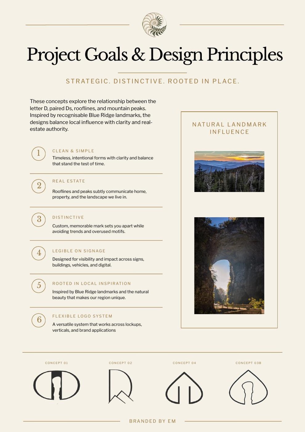
Six principles were set at the start: clean and simple with timeless forms, a real estate reference through peaks and rooflines, something distinctive enough to avoid overused motifs, full legibility at signage scale, a rootedness in Blue Ridge local references, and a flexible system that would work across all lockups and brand applications.
Charlottesville and the Blue Ridge are visually specific places. Natural Bridge, a famous sandstone arch in the Blue Ridge Mountains, came up multiple times as an inspiration point. The symbolism worked well for a real estate agent, moving through a bridge into the next chapter of life. The mountain forms themselves, those layered receding ridges, were always going to be in the mix. Jefferson's architecture informed the softness of curves where they appeared.
Having three initials instead of two creates a design challenge. DTD is harder to make into a clean monogram than DT or TD would be. The T needed to earn its place in the mark rather than just being crammed in. The solution across several concepts was to have the T work implicitly, through peaks and toplines that referenced it, rather than sitting as a literal letter alongside the Ds.
Round one: four concepts
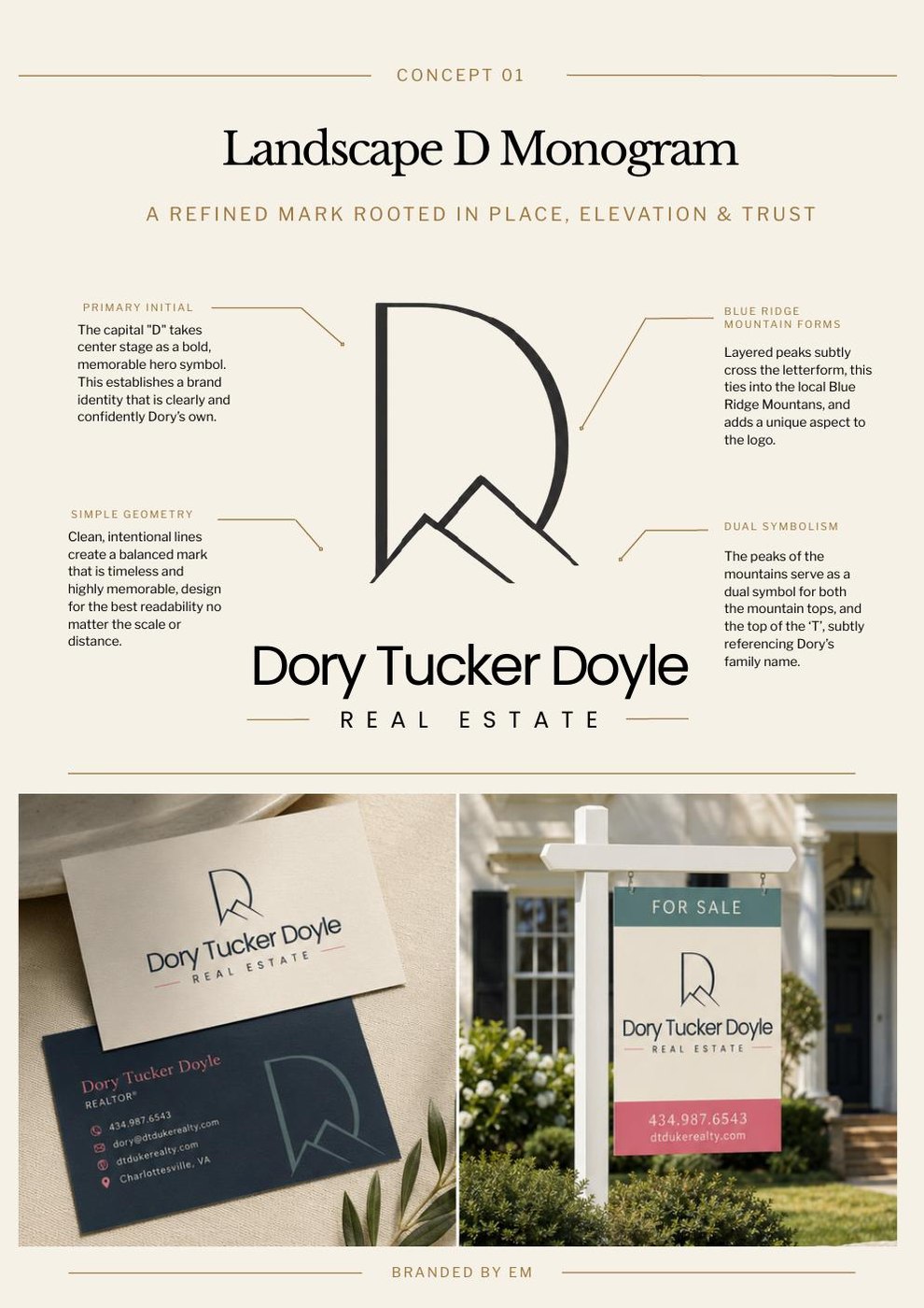
The D as a landscape, with the Tucker T hidden inside the peaks
The first concept put the capital D front and centre as the brand's primary symbol. That matters because a real estate agent is a personal brand, and leading with the initial makes the identity feel like it belongs to someone specific rather than a company. Clean, intentional lines built for maximum readability at any scale or distance.
The Blue Ridge mountain peaks are layered across the D form, referencing the landscape Dory works in every day. But they also do a second job: the peaks of the mountains act as a subtle stand-in for the top of the T in Tucker. So the T is in there, honouring Dory's father's name, without having to be stated as a literal letter. Most people would never consciously notice it, but the mark carries that personal meaning regardless.
Concept 01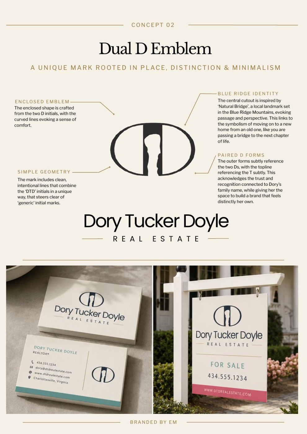
A Natural Bridge reference, and a mark that hides a house inside a monogram
Concept 02 was a Dual D Emblem. The enclosed shape is formed from the two D initials, and the central cutout inside it was directly inspired by Natural Bridge, the famous sandstone arch in the Blue Ridge Mountains. The symbolism is genuinely relevant to what a real estate agent does: moving through a bridge into the next chapter of life. The outer forms subtly reference both Ds, and the topline picks up the T without forcing it. The curved lines were chosen to feel comfortable and welcoming rather than angular and transactional.
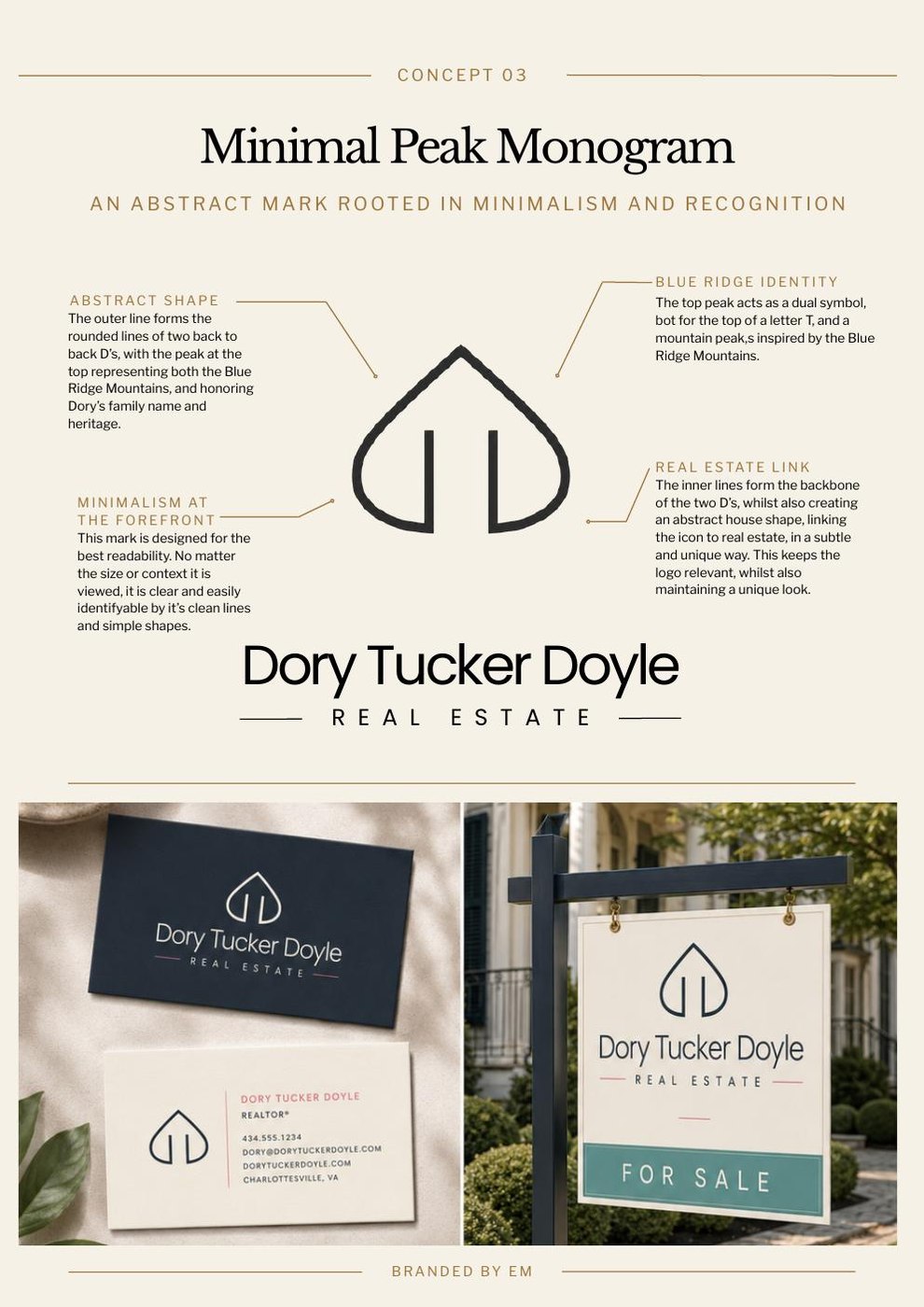
Concept 03 took the same two back-to-back D forms but simplified them further. The outer lines become more abstract, the peak at the top reads as both a mountain and the T, and the inner lines create a subtle house shape that ties the mark to real estate without spelling it out. Pure minimalism with three things happening at once. This is a hard balance to achieve, and it worked well as a standalone mark even if it needed the wordmark alongside to be immediately legible for someone unfamiliar with the brand.
Concepts 02 and 03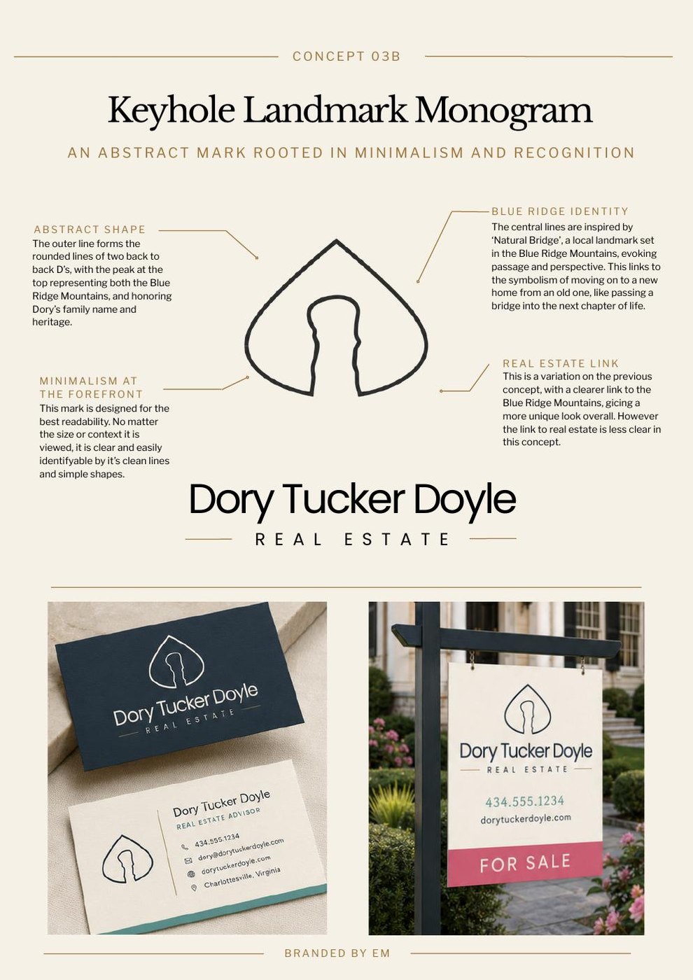
A stronger local reference, a weaker real estate link, and what the client chose to develop
Concept 03B was a variation on 03 but with the Natural Bridge reference made much more explicit. The arch form in the centre is unmistakably a landmark shape, which makes the local connection very clear. The downside is that it reads less clearly as real estate. That is a real trade-off worth documenting: the more specific and poetic a reference is, the less it communicates category. A non-local viewer seeing 03B would know it was distinctive, but they would not know it was an estate agent.
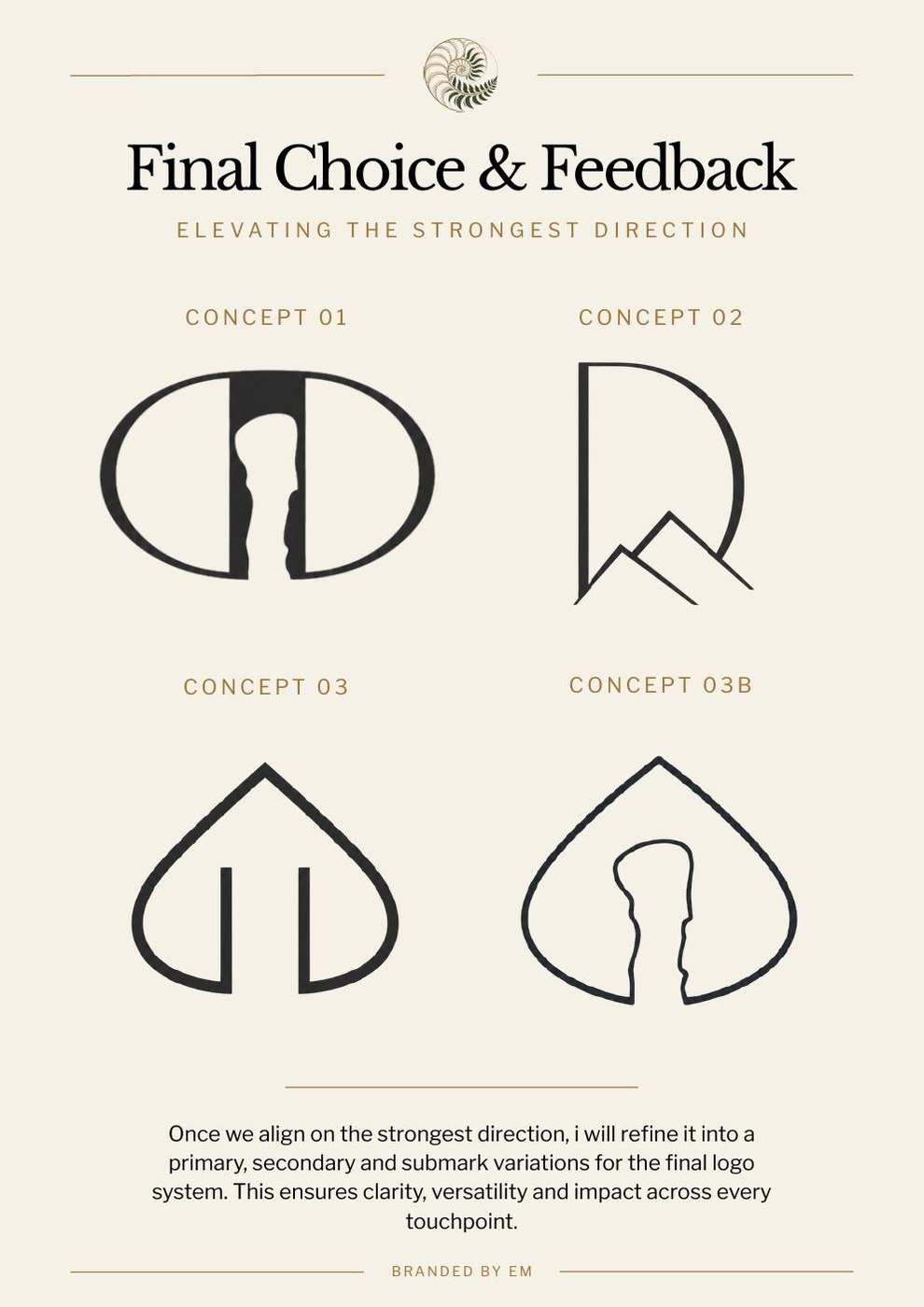
The client review highlighted Concepts 01 and 03B as the strongest directions. 01 for the clarity of the D and the mountain duality. 03B for the depth of the local landmark reference. The next stage took those two instincts and tried to find a direction that kept what worked in both: a strong initial-led mark, clear mountain references, a roofline element to ground it in real estate, and the T woven in where possible.
Client reviewRound two: three routes and a decision
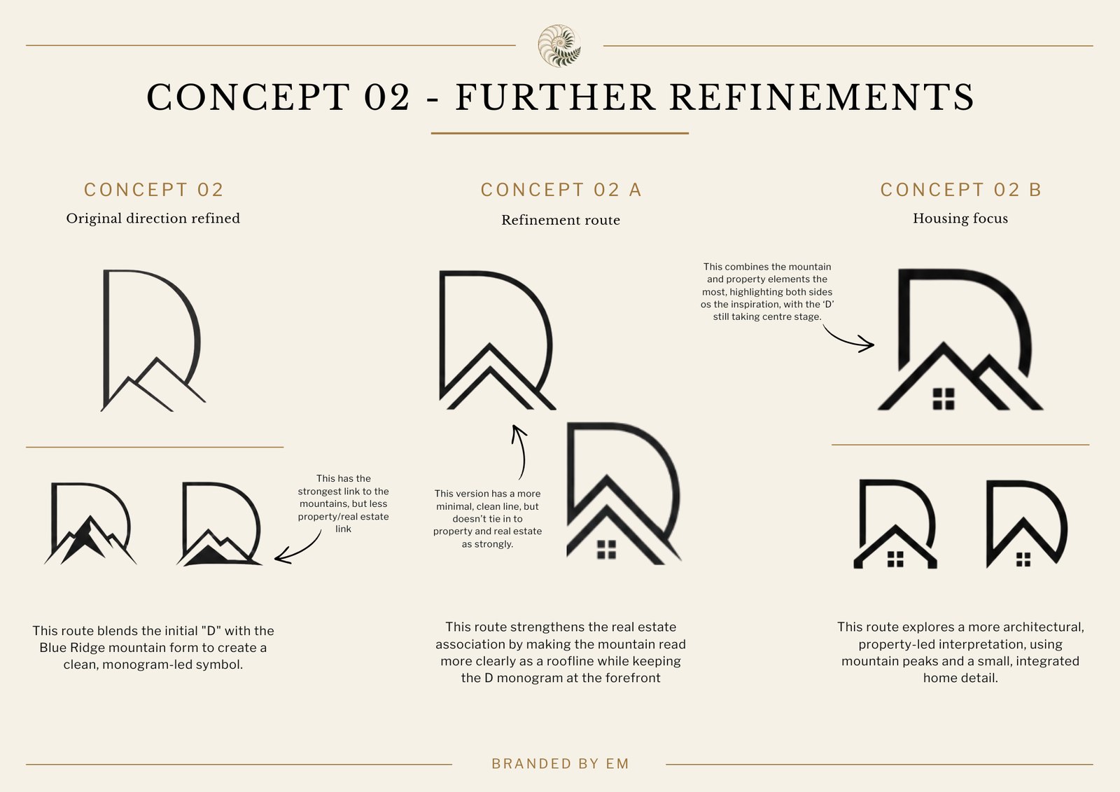
Taking the chosen instincts in three directions to find the right balance
Following the client review, the development went into three parallel routes, each taking the D-with-mountain concept somewhere different. The first route (02) kept the D as the dominant form with mountain peaks blended inside it. Strong mountain reference, strong initial, but the real estate link was still implicit rather than clear. This had the closest connection to the Blue Ridge as a landscape, but it could still read as an outdoor or nature brand to someone unfamiliar with Dory.
The second route (02A) shifted the mountains to read more clearly as a roofline, using cleaner chevron shapes. This version had a stronger property association, but the minimal treatment felt a bit cold, and the monogram link was not as integrated as it needed to be. There was a visual awkwardness in how the roofline related to the D form.
Route 02B was the one that got taken forward. Using the full DTD initials rather than just the D, it read the rooflines through all three letters, with two smaller peaks flanking the central one and a small window detail anchoring it clearly in real estate. The T is doing proper work here, integrated into the roofline system rather than being a standalone letterform. This version had the clearest category communication, the strongest local reference, and the most opportunity to be a distinctive mark at scale.
Second round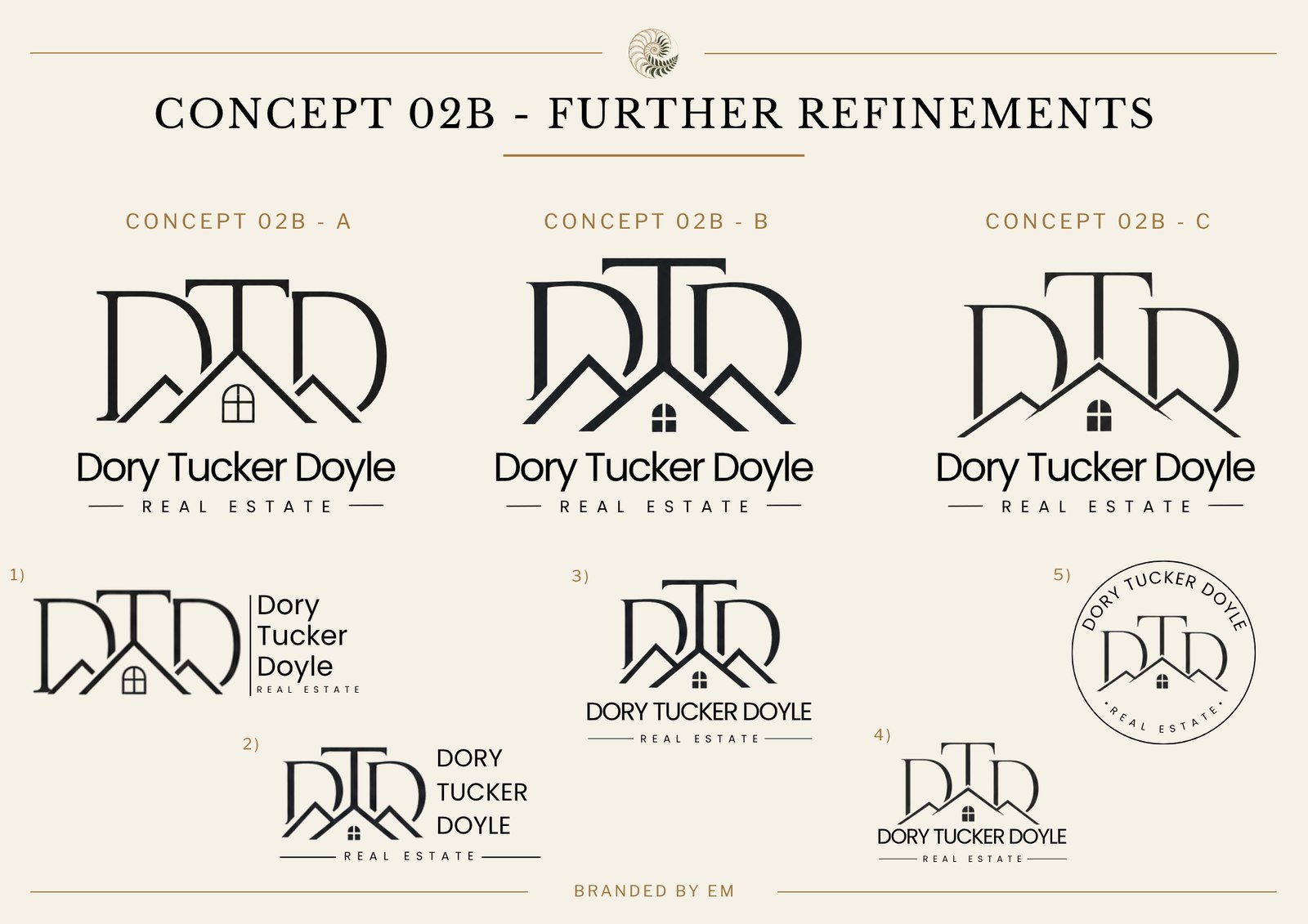
Getting the letter weight right, and working out every format the mark would ever need
Once 02B was confirmed as the direction, it went through three weight and proportion variations. Sub-variant A had the lightest letterforms with the most open spacing between elements. Sub-variant B pushed them heavier and bolder, which gave the mark more authority on a sign but started to bury the roofline elements inside the heavy initials. Sub-variant C found the balance: enough weight to hold up at distance, enough space between the letters and the roofline for both to read clearly.
The lower half of this presentation sheet shows five different lockup arrangements. This matters more than it might look like it does. A brand mark lives in wildly different contexts, and a client needs to see upfront how the mark behaves in all of them. The stacked version with the full name and REAL ESTATE descriptor is for business cards, letterheads and printed collateral. The horizontal version is for website headers and signage where vertical space is limited. The circular seal is for social media profile images, property listings stamps and any badge-format application. Having all five confirmed and consistent with each other at this stage means they are ready to go whenever they are needed, without a designer having to adapt them one by one later.
Sub-variants and lockup formats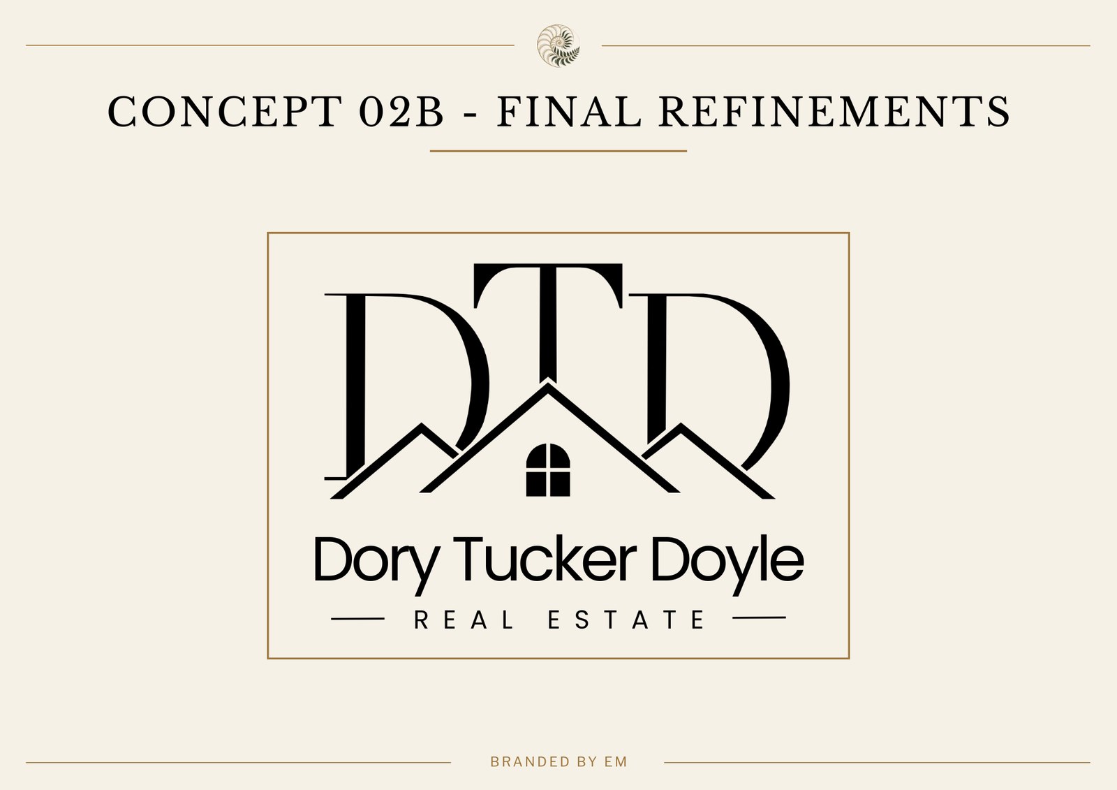
The mark that got approved, and the thinking behind the typography below it
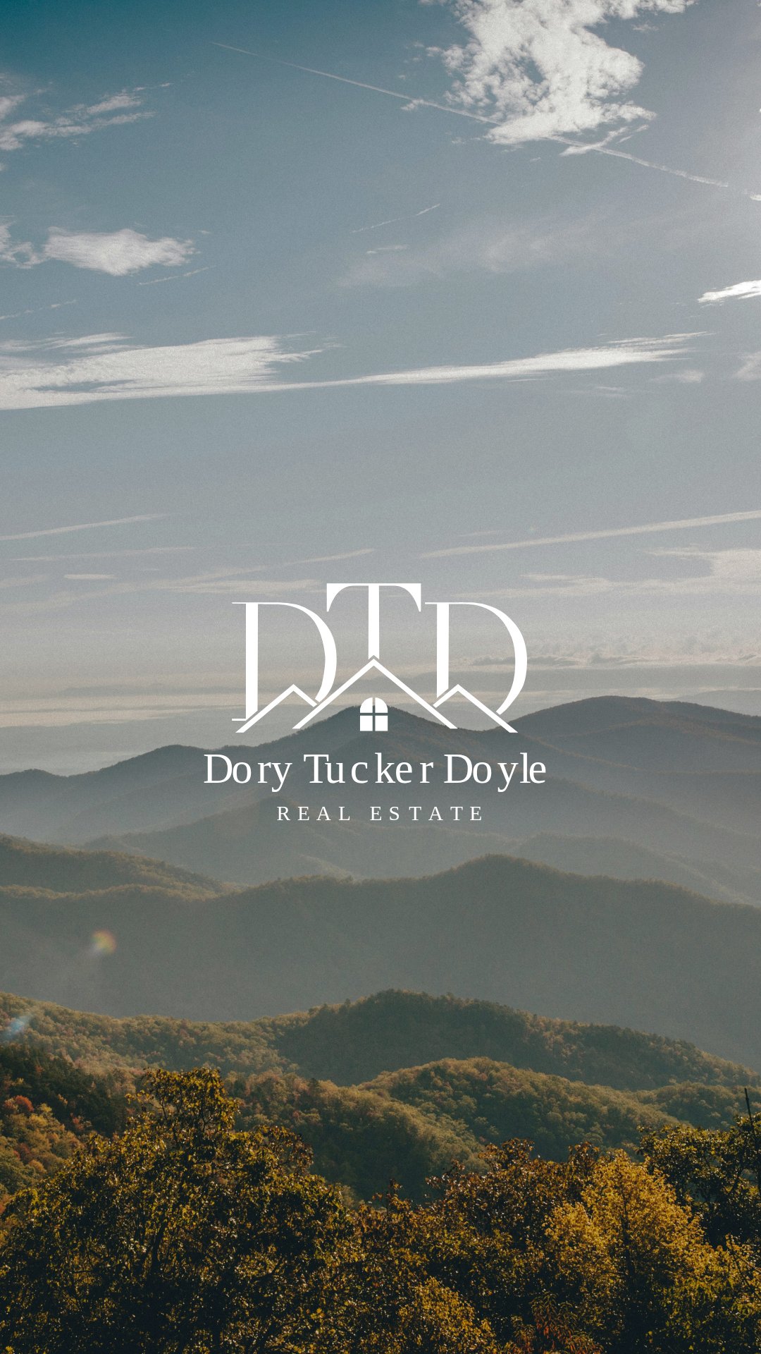
The final concept presentation shows the resolved direction. The DTD initials carry the rooflines through their structure. The central window sits where the three elements meet. Below the mark, the full name is set in a mixed-case serif, which was a considered choice rather than a default one.
The DTD monogram is structural and architectural, all angles and geometric weight. Setting the full name in a geometric sans-serif below it would have created a clash where both elements were trying to do the same thing. A serif brings a different quality, warmth and a kind of personal authority that is associated with names rather than companies. For a brand where the whole point is that this is a specific person you are trusting with a major life transaction, that distinction matters.
The REAL ESTATE descriptor in spaced caps sits as a third level of hierarchy. It communicates the category without competing with the name above it. Three clear levels, mark, name, descriptor, give the eye a clean path through the lockup and mean the whole thing reads as one piece of communication rather than separate elements near each other.
Final direction approvedGrid checks before delivery
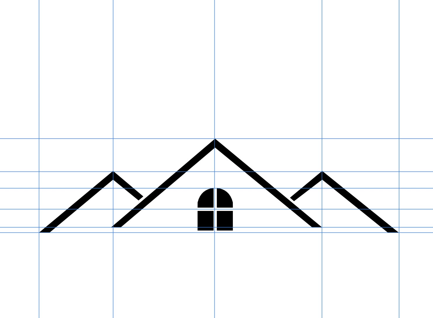
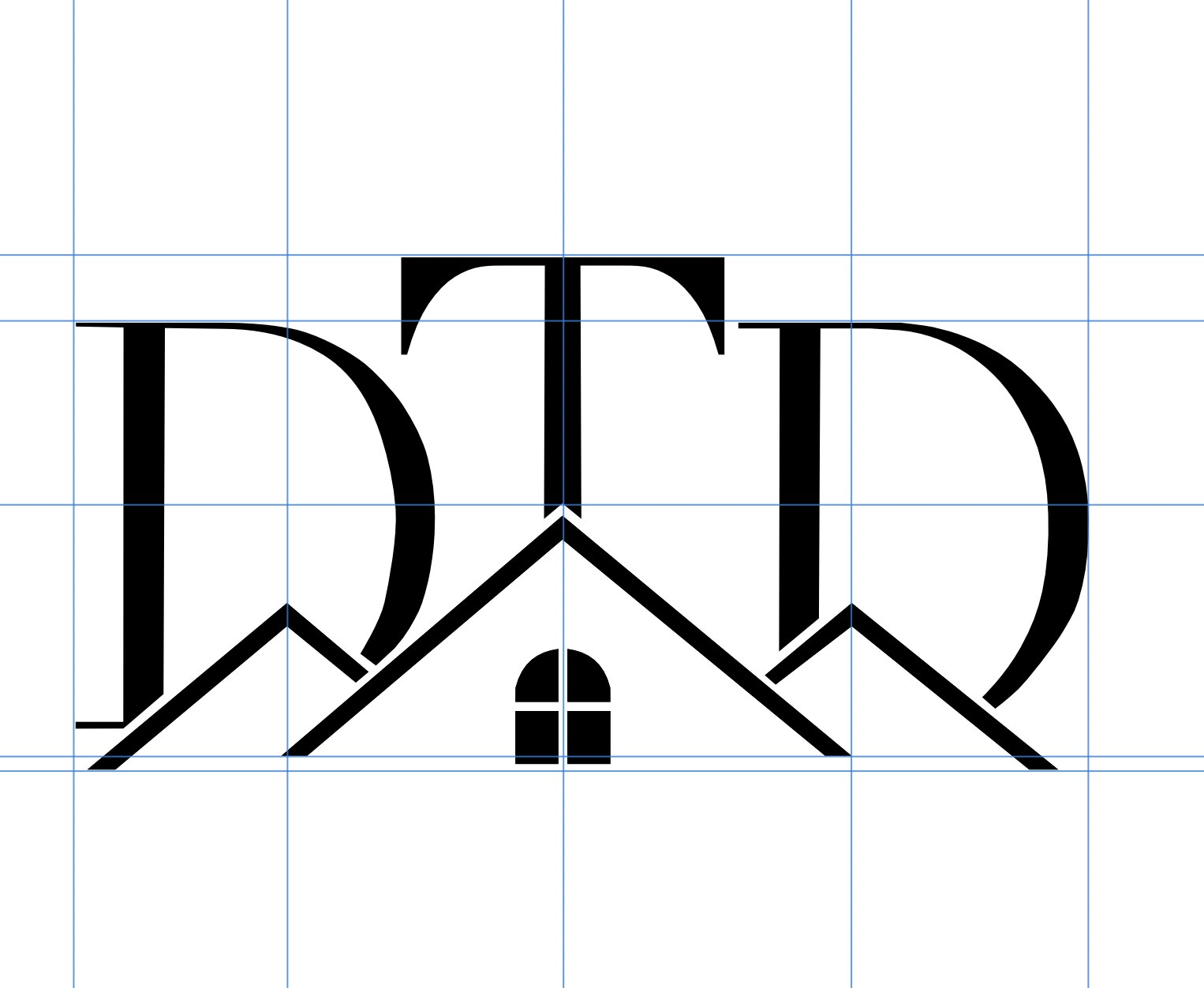
Why every variant gets checked on a grid before it goes anywhere
The standalone icon, the roofline with window stripped back without the initials, is the version that gets used at very small sizes. Favicons, watermarks, property stamp details. At those sizes the DTD letterforms disappear, so the mark has to work through shape alone. The grid check confirms that the peaks are clearly distinct from each other and the window has enough size to remain legible. If this does not hold up at small scale, the mark needs adjusting before delivery, not after the client starts using it on everything.
The monogram check shows the full DTD mark being verified for internal alignment. Any logo that combines multiple shapes has the potential for elements to drift slightly out of optical balance during the building process. You correct it by checking against guides, not by trusting that it looks right at the design stage. These screenshots are documentation that the check happened, not just that the mark was made.
Affinity Designer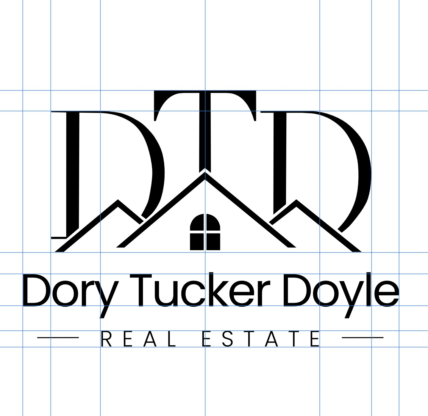
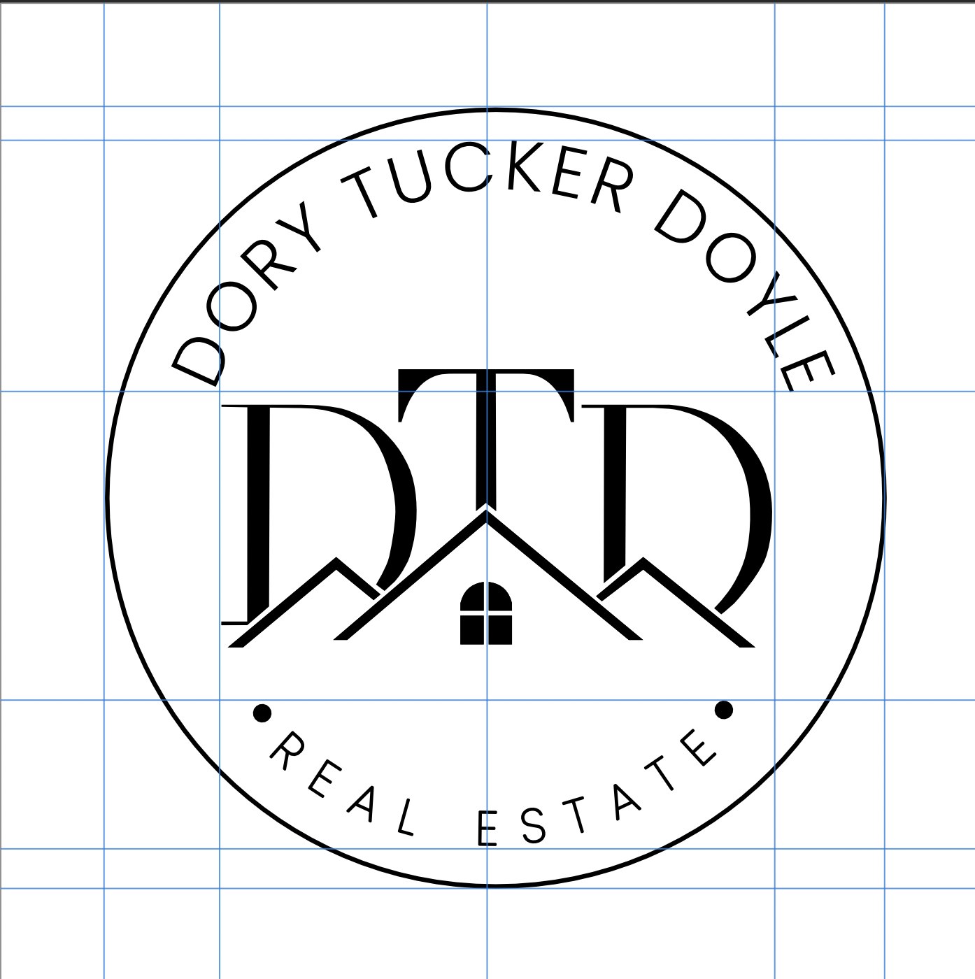
Making sure the full lockup and the circular seal are consistent across the whole system
The full lockup check confirms that the mark, the name and the descriptor all share the same optical left and right edges. Not mathematically the same, but visually the same. The wordmark Dory Tucker Doyle is a different width from the descriptor REAL ESTATE, which is a different width from the mark itself. Getting all three to feel anchored within the same invisible column is what makes the lockup read as one composed piece rather than three elements that happen to be stacked.
The seal is checked separately because circular text has its own alignment issues. When letters are placed on a circular path, the gaps between them change depending on where they sit on the arc. Gaps that look right at the top of the circle can feel too open at the sides. Every letter pair in the Dory Tucker Doyle arc and the Real Estate arc was checked and adjusted by hand. There is no tool that does this for you, it is something you have to work through letter by letter until the spacing feels consistent all the way around.
System consistencyThe five delivered variants
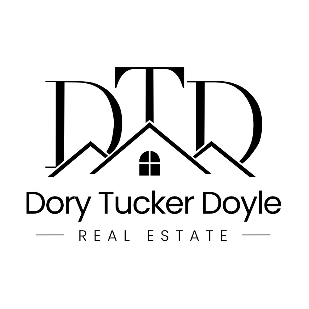
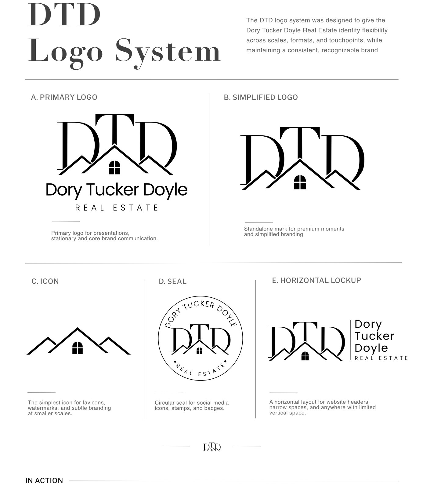
Five variants were delivered. The primary lockup is for business cards, stationery and printed materials where the full name needs to be present. The simplified mark without the wordmark is for contexts where the brand needs presence without spelling everything out. The icon, the roofline and window stripped back to its most basic form, works at favicon size, embossed on stationery or anywhere the mark needs to survive at very small scale. The circular seal covers social media profile images and any badge-format application. The horizontal lockup is for website headers and signage where vertical space is tight. Every version was built as part of the system rather than adapted separately, which means they are all visually consistent with each other no matter which one is being used.